Overview
Designing enrolment that runs itself
Joining a group benefits plan used to take two people, a stack of paper and two sign-ups. The plan administrator, the person at the employer who runs the plan, emailed forms out and typed the answers back in. The plan member, the employee, filled them out, waited, then registered again to get online. I redesigned Add a Member in the administrator portal and designed member registration end to end, so each person's step hands off to the next on its own.
- Problem
- Two users, one employee's details typed in twice, and paper and email in between.
- Deliverable
- Add a Member (one person or a bulk upload) for administrators, and member registration with optional coverage.
- Tools & timeline
- Figma, Zeplin
- May to Dec 2021 · research to high-fidelity in 1 month
Outcome
- ~8 minto register online, down from paper and a second sign-up
- +63%Optional Critical Illness purchases
- +18%coverage taken without medical evidence
- 6,000+users in month one, rated 4.7 / 5
Measured after launch in 2021.
Framing
Two players
Two people, one new employee
- Admin
Plan administrator
Adds new hires, often a whole group at once. In the old process they emailed each person a package, then typed every returned form into our system by hand.
- Member
Plan member
Got a package of forms full of unfamiliar terms, sent it back by email, waited to hear whether it went through, then registered a second time for the member website.
Solution
Service blueprint
Who acts next, at every step
Three lanes, five handoffs. Most of the old delay lived in the gaps between people, so I designed the gaps first. Tap a handoff to jump to the screen that shows it.
-
- Admin
- Adds one person or uploads a file.
- Member
- Nothing to do
- System
- Checks each row and creates the member.
-
- Admin
- Nothing to do
- Member
- Nothing to do
- System
- Emails the member an invitation that links straight into enrolment. No task left for the administrator.
-
- Admin
- Nothing to do
- Member
- Works through six steps: personal details, banking, dependants, coverage, beneficiaries, then review and submit.
- System
- Nothing to do
-
- Admin
- Nothing to do
- Member
- Sees current coverage beside the enhanced option and the change in monthly cost. Then registers the online account in the same flow.
- System
- Nothing to do
-
- Admin
- Sees each member's status and deadline on the Member Enrolment list, and follows up on anyone still in progress.
- Member
- Nothing to do
- System
- Confirms enrolment to the member, with their benefits card to download and the date coverage starts.
Design
One flow, two people
Steps 1 to 3 belong to the administrator, and the video shows the shipped portal. Steps 4 to 6 belong to the member, redrawn from the shipped site with generic data.
-
Step 1 · Admin
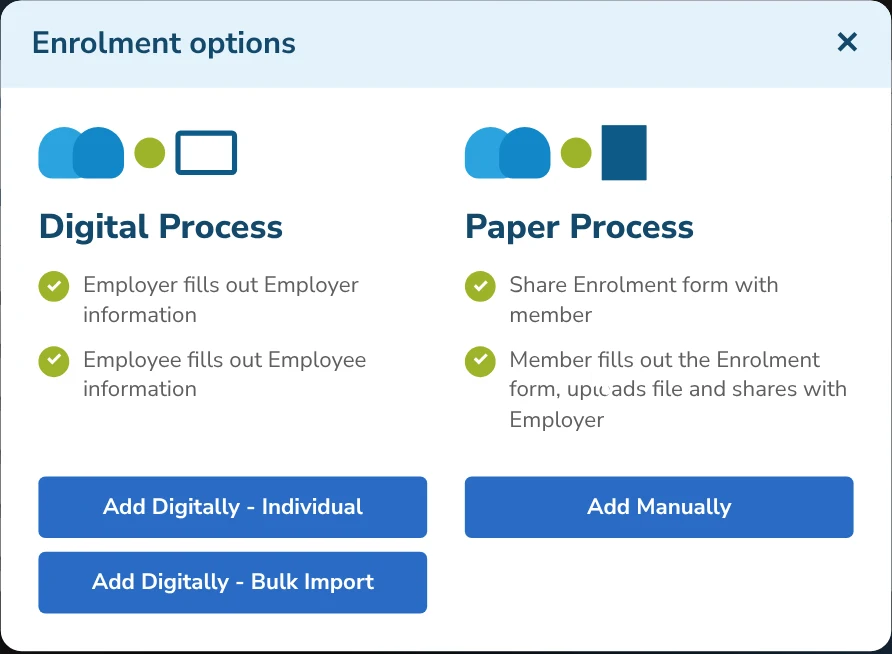
Choose how to add
Enrolment options puts the two paths side by side. Digital: the employer fills in employer details and the employee fills in their own, one person at a time or as a bulk import. Paper stays as a fallback, not the default.
-
Step 2 · Admin
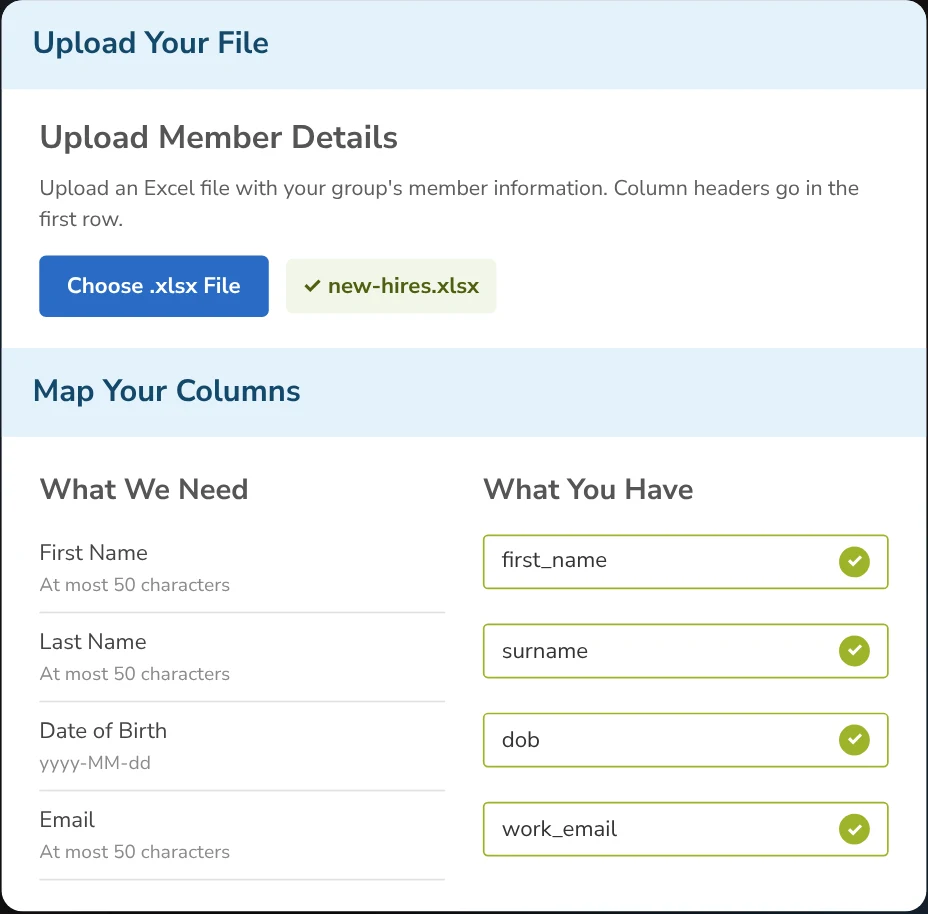
Upload and map your file
Upload our template or your own spreadsheet, then match "What we need" to "What you have", column by column. Missing fields can be filled in right there.
Why Administrators already kept employee lists in their own spreadsheets, so the upload starts from their file, not ours.
-
Step 3 · Admin
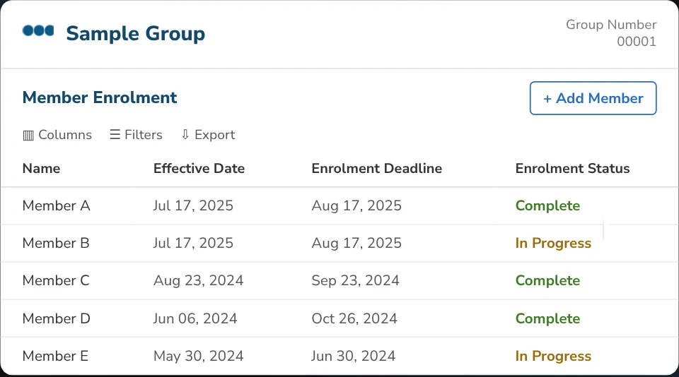
Track every enrolment
Invitations go out on their own. The Member Enrolment list shows each person's effective date, enrolment deadline and status, Complete or In Progress, so the administrator knows who to follow up with.
-
Step 4 · Member
Six steps from one invite
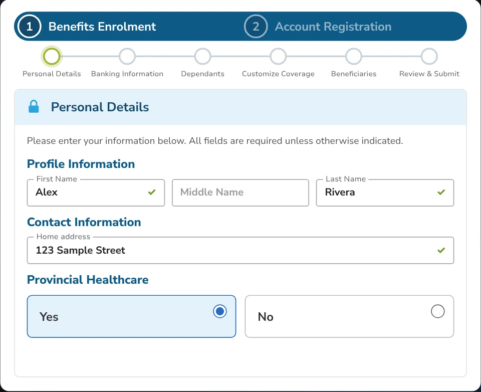
The invitation email links straight into enrolment. A navy stepper shows the whole path: Personal Details, Banking Information, Dependants, Customize Coverage, Beneficiaries, Review & Submit, each ticked off as it's done. Fields confirm themselves with a check as they're filled.
-
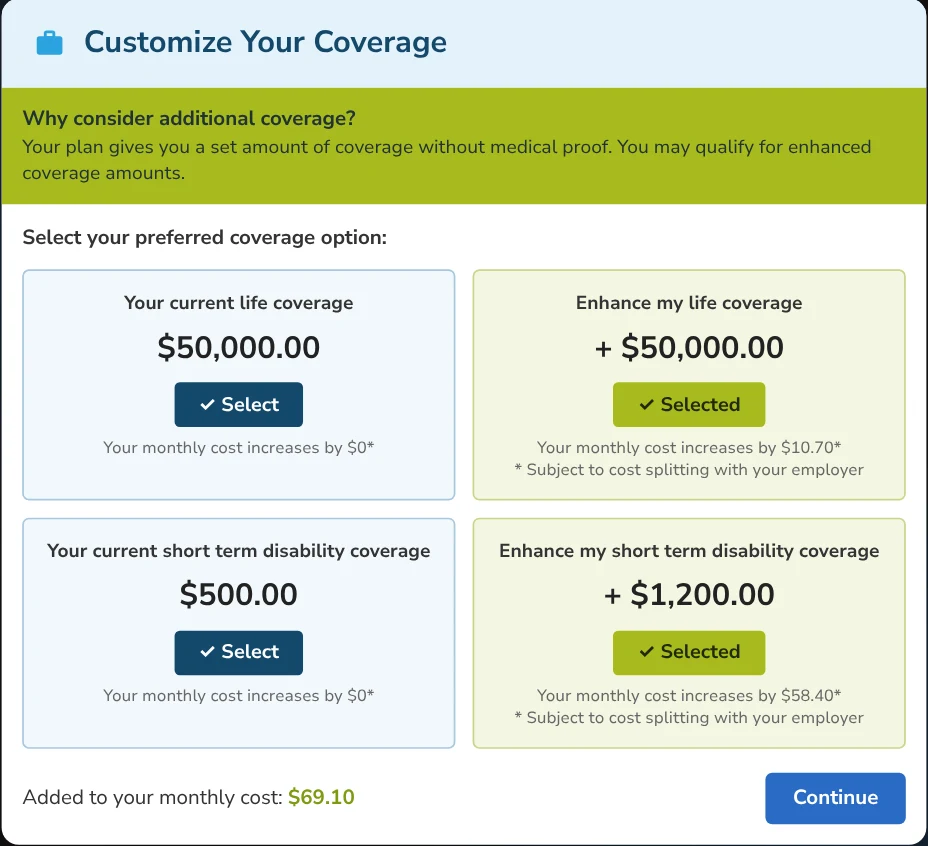
Step 5 · Member
Customize coverage
Each benefit shows the member's current coverage beside the option to enhance it, and how much the monthly cost goes up, subject to cost splitting with the employer. A plain-language tip sits beside each unfamiliar term.
Why In the prototype test, members stopped at terms like the non-evidence maximum. The tip answers the question where it comes up.
-
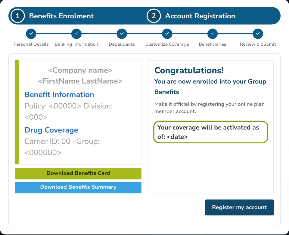
Step 6 · Member
Enrolled, then registered
The last screen says it plainly: you are now enrolled. It shows the benefits card to download and the date coverage starts, then goes straight to Account Registration, the second half of the same flow. About 8 minutes end to end.
Why In the old journey, members asked "why do they need to register for another thing?" Registration now follows enrolment in one pass.
Delivery
Handoff
What designing enrolment taught me
Design the handoff, not just the screens
- Most of the old delay lived between people.
- Naming who acts next at every step made the gaps visible, and then fixable.
Design for the tenth use
- Administrators enrol people every month. The flow has to be fast the tenth time, not only clear the first.
Jargon is a support ticket waiting to happen
- Members stopped at terms like the non-evidence maximum.
- A plain-language tip beside the choice answers the question where it comes up.