Skin Mode is a wax studio in Toronto that also does facials. Waxing has a trust problem: people put off a first visit because they are nervous about pain, privacy and hygiene. The owner wanted a brand that felt confident without feeling clinical or cute. I led the brand strategy, the identity and the launch content, from a review of eight brands to a design system and a ready-to-post Instagram grid.
Problem
Toronto wax bars feel friendly but generic and promo-led. Premium feels medical. Nervous first-timers have nowhere to land.
Deliverable
Competitor review, four style directions, five palettes, seven brand boards, a design system, a logo suite and an Instagram launch grid.
Tools & timeline
Figma
From October 2026
Skin Mode · Toronto
Book your mode.
Mode off · quiet, bone and espresso
Demo · flip the switch. The brand idea is a toggle, so the demo is one too.
What I'm measuring
First visitsBookings that come from Instagram, tracked with a link-in-bio code
RebookingShare of first-timers who book again within four weeks
SavesSaves on the education posts the launch plan leans on
The rebrand launched in November 2026, so there are no results yet. These are the first three things I'm tracking.
The Wax Lab
Who is nervous, and about what
A wax is personal. People worry it will hurt, that the room will not be clean and that they will be judged. The brand has to answer those worries before anyone asks. I wrote for three groups.
First-timers
They have shaved for years and keep putting off a first wax. They need every step shown.
Regulars
They wax every few weeks and want it quick, clean and priced up front.
Event bookers
A wedding, a trip, a shoot. They need to know when to book, not just how.
Problem
Friendly, or premium. Never both.
I reviewed eight Instagram accounts in four groups: Toronto wax bars, experience and format models, intimate-care brands and skincare identities. The wax bars were friendly but promo-led. Premium in Toronto mostly meant medical. Intimate-care education was owned by product brands that do not offer a service.
01Eight accounts
02Borrow and leave behind
03Eight shared patterns
04The gap (what the audit produced)
05Guardrails (what the audit produced)
Constraints
Rules I set before any design
8accounts reviewed
4rules set before any design
Show hygiene, don't claim it
Fresh spatula, sealed kit, gloved hands.
No "clinically clean" claims.
No bodies on show
Never film intimate waxing.
No before-and-after body photos.
No medical promises
No "treats", "cures" or percentages.
Process facts only.
Own a colour
Red on white already belongs to another skincare brand.
Orange, lilac, amber and spa blue are taken.
Landscape
What the category looks like
Two Toronto wax bars, a Yorkville medspa, a facial chain, two intimate-care brands and two skincare identities. For each one I wrote down one thing to borrow and one to leave behind.
Toronto wax bars
Borrow: teaching carousels, one accent colour on props. Leave: palette sprawl and promo-led grids.
Yorkville medspa
Borrow: the client journey as a carousel. Leave: medical claims.
Intimate-care brands
Borrow: a poster template. Leave: red on red.
Skin Mode
Medspa-calibre design at wax-bar prices, with a voice that names the awkward bit.
Tradeoffs
From four styles to one switch
I tested in two rounds. First, four style directions and five palettes, each shown on the same posts. Then seven full brand boards. The owner chose Frame 1, Mode On. Each pair below is a choice we made along the way.
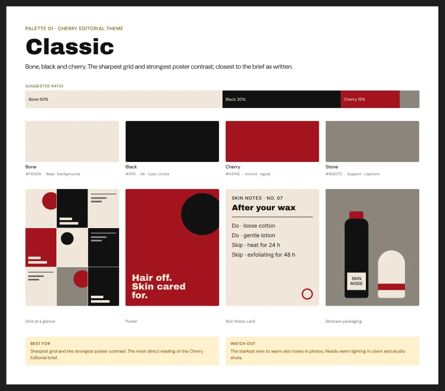
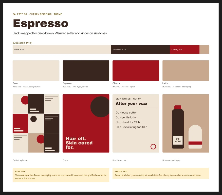
01Brown instead of black
Left behind · Classic, blackChosen · Espresso
Deep espresso replaced black across the system.
Why
Black was the starkest next to warm skin tones. Deep brown is softer, kinder on every skin, and reads as premium skincare.
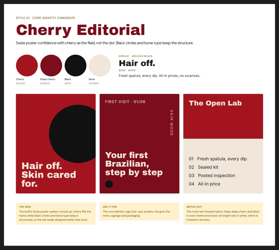
02The loud one, made warm
Left behind · Cherry Editorial as the coreChosen · Mode On as the whole identity
The switch became the identity, with everything around it calmed down.
Why
My own board warned that Mode On "can read gym rather than spa". The switch was too good to keep for reels, so I kept it and calmed the rest: Espresso, DM Sans body copy and a warm voice.
03A red we can own
Left behind · Red on whiteChosen · Bone and Espresso, cherry as the signal
Bone and brown carry the grid, so cherry reads as the signal, not the wallpaper.
Why
A cherry-red skincare brand already owns red on white.
Brand system
Structure
One idea, three layers
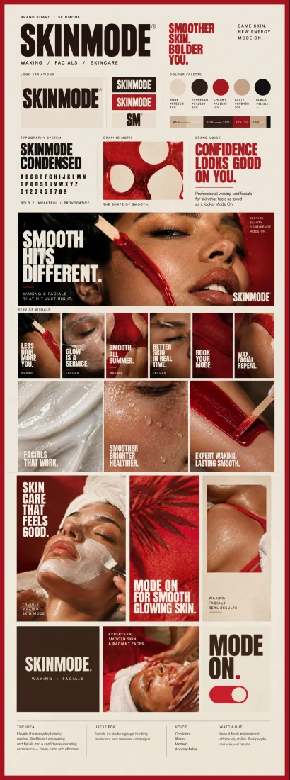
The brand idea is one line: same skin, new energy, mode on. The switch carries it into the logo, the posts and the studio. Underneath sit four colour roles, two typefaces and a voice that is confident enough to say it plainly and warm enough that a nervous first-timer books anyway.
Mode On
The identity, piece by piece
Scroll through the system. The frame on the left follows along.
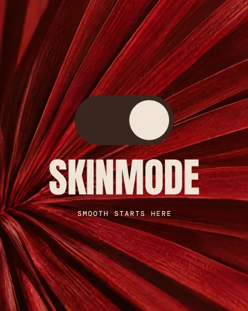
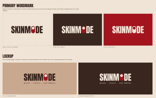
The wordmark is heavy, condensed and uppercase, with the O replaced by a switch in the on position. A lockup adds "Waxing · Facials · Hair removal". Under 80 pixels, the SM monogram takes over.
Bone is the base, half of everything. Espresso is the ink, about a third. Cherry is the signal for headlines and buttons. Latte is for packaging and tiles. Never cherry on espresso: the two turn muddy.
Step 3
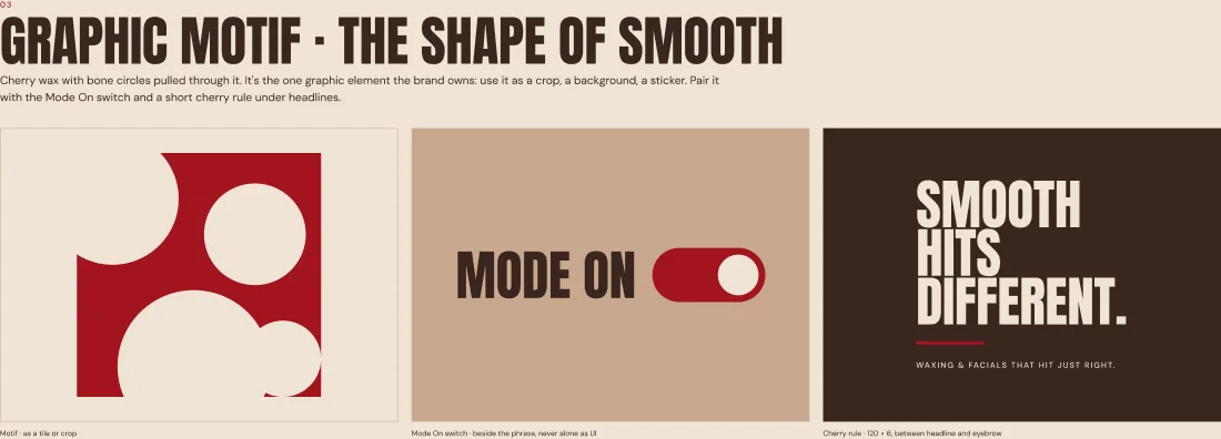
The shape of smooth
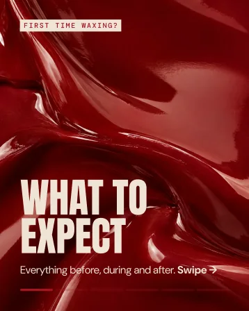
Cherry wax with bone circles pulled through it: the one graphic the brand owns. It works as a crop, a background or a sticker.
Step 4
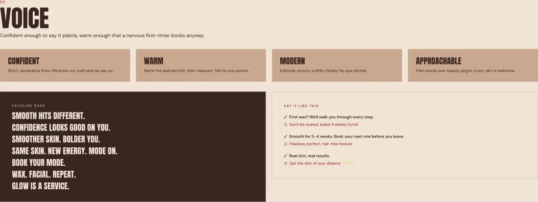
Say it like this
"First wax? We'll walk you through every step." Not "Don't be scared, babe! It barely hurts!" Name the awkward bit, then reassure.
Step 5
Posts from the system
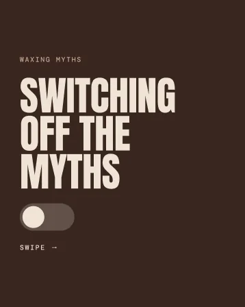
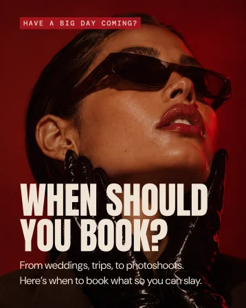
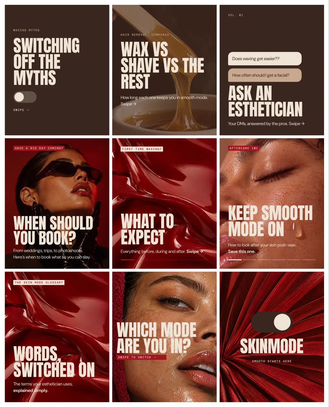
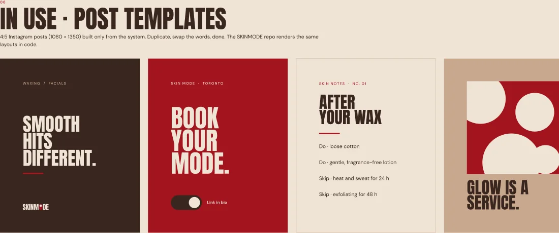
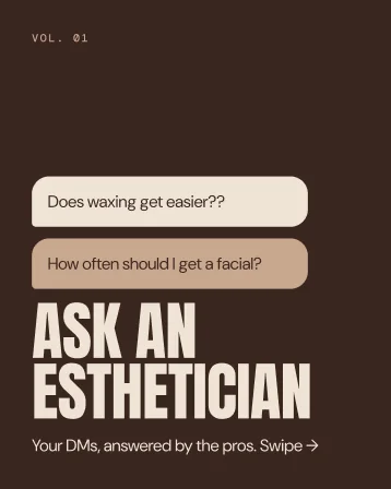
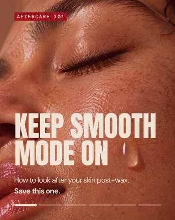
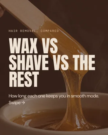
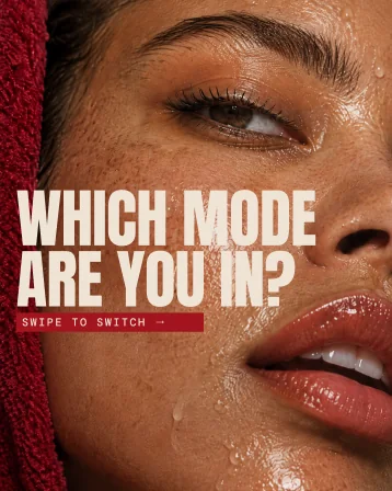
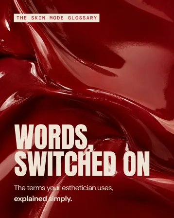
Four templates (headline, call to book, Skin Notes, motif) and a launch grid: myths, wax versus shave, ask an esthetician, aftercare, a glossary.
Marketing materials
The launch grid
Every post in the grid
Handoff
What Skin Mode taught me
Don't drop the loud idea. Calm the rest.
I flagged Mode On as too gym-like for a spa. The fix was not a quieter idea but a warmer palette and a kinder voice around it.
Trust is a design problem
The first-timer's fear decided the system: show the fresh spatula, list the steps, put the price up front, never show a body.
Write the "never" list first
Four rules, written before any design, saved hours of debate later. Every board was checked against them.
For small business owners
If your service makes people nervous, your brand's first job is to answer the worry. You get a position, a logo suite with rules, four colours with jobs, post templates you can duplicate and fill in, and a "never" list that keeps everyone on brand.