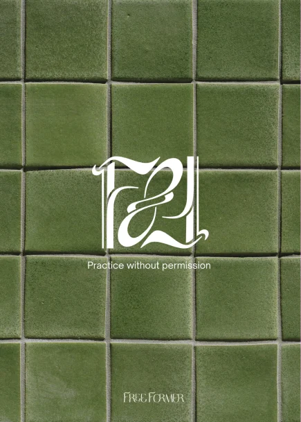
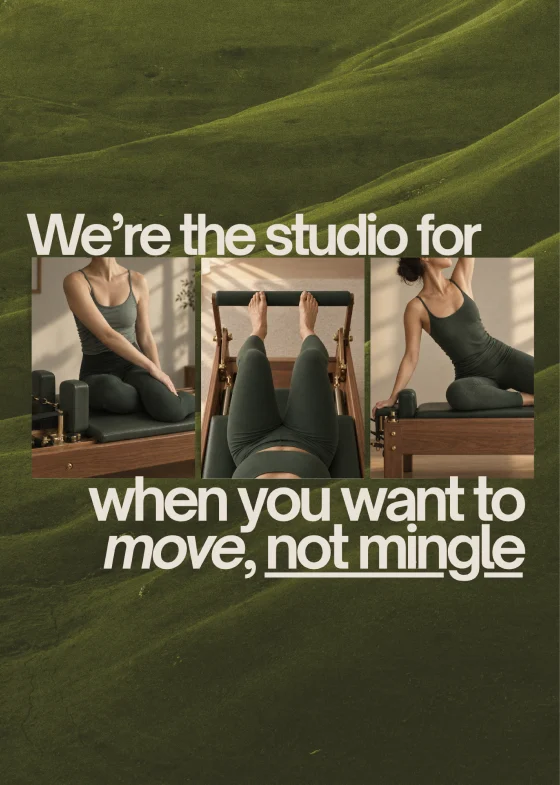
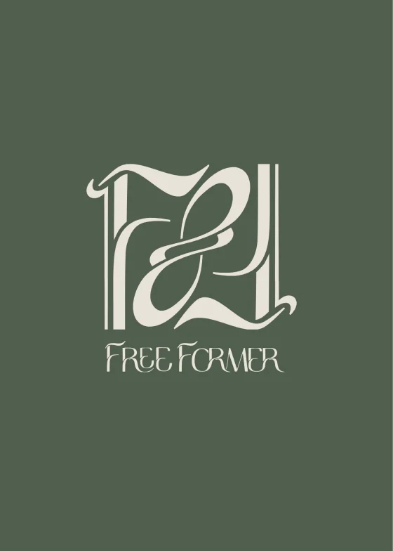
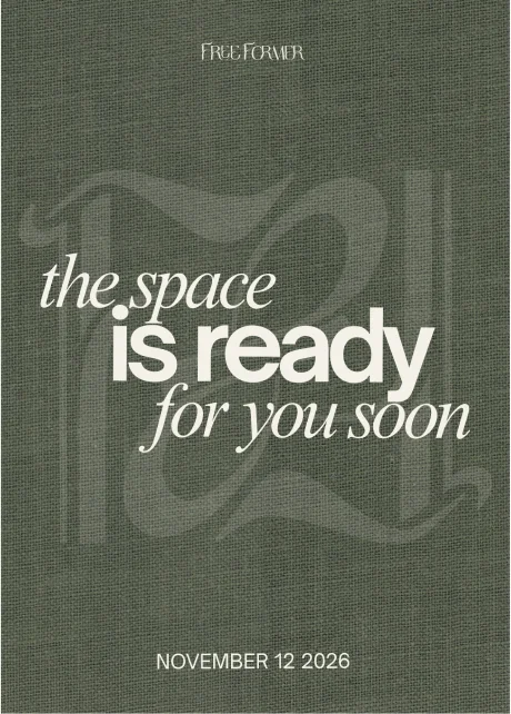
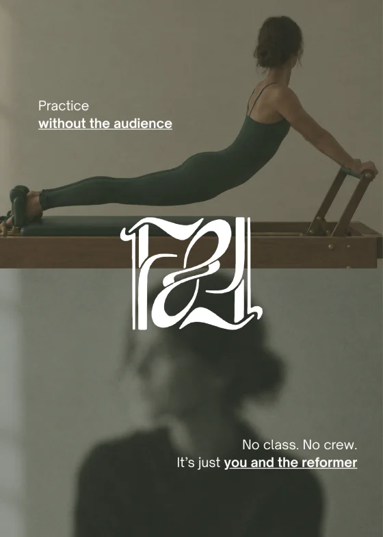
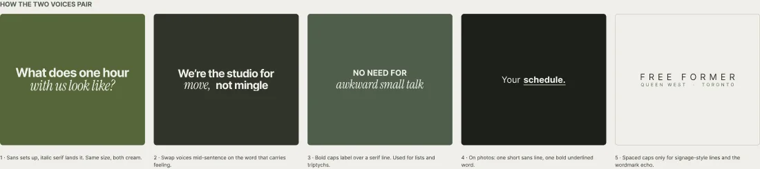
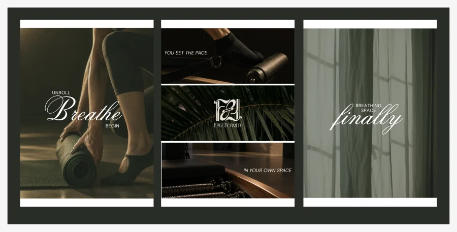
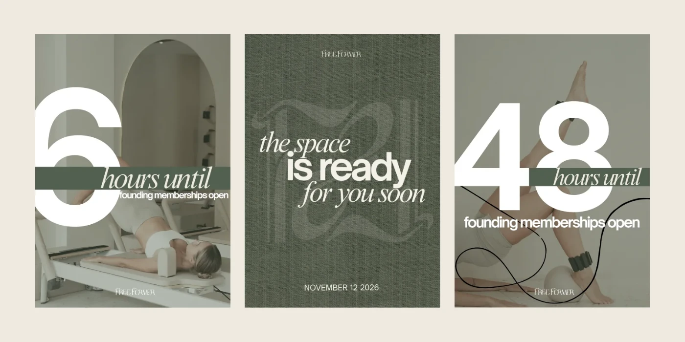
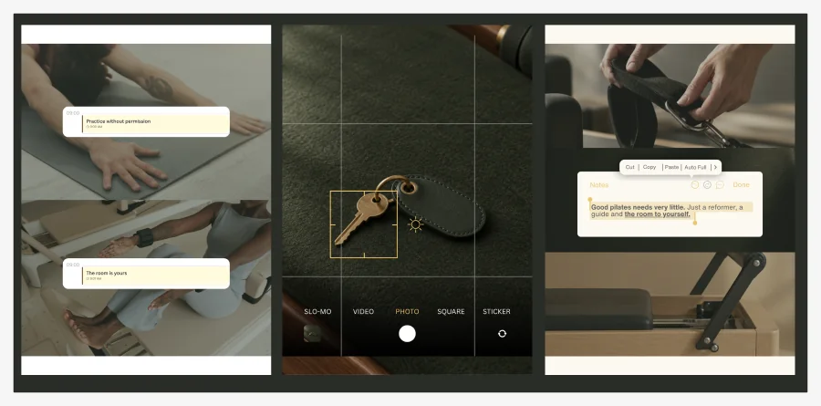
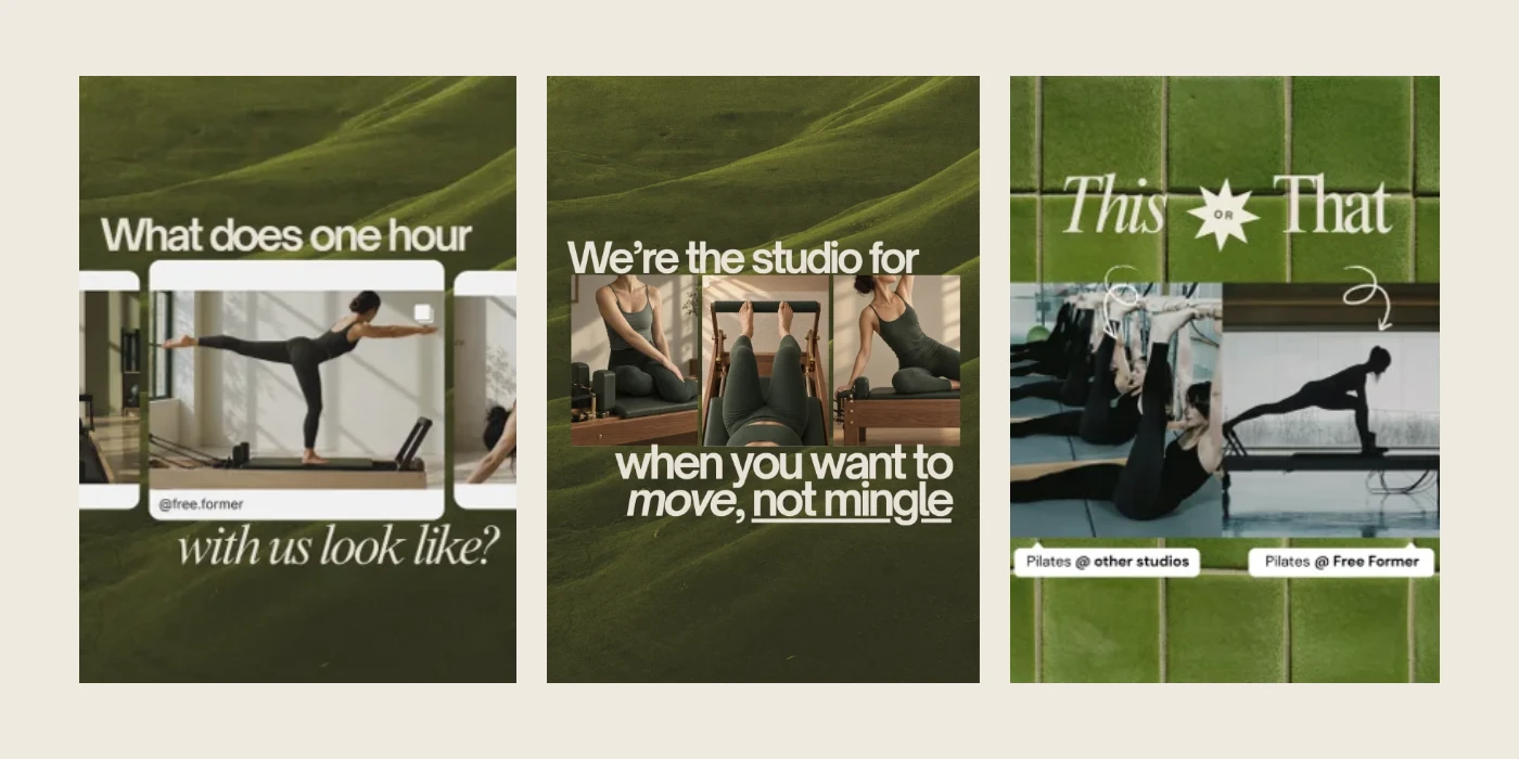
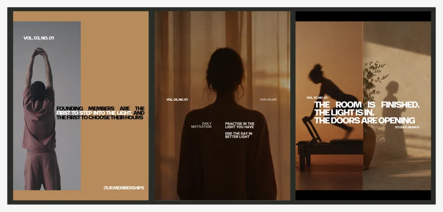
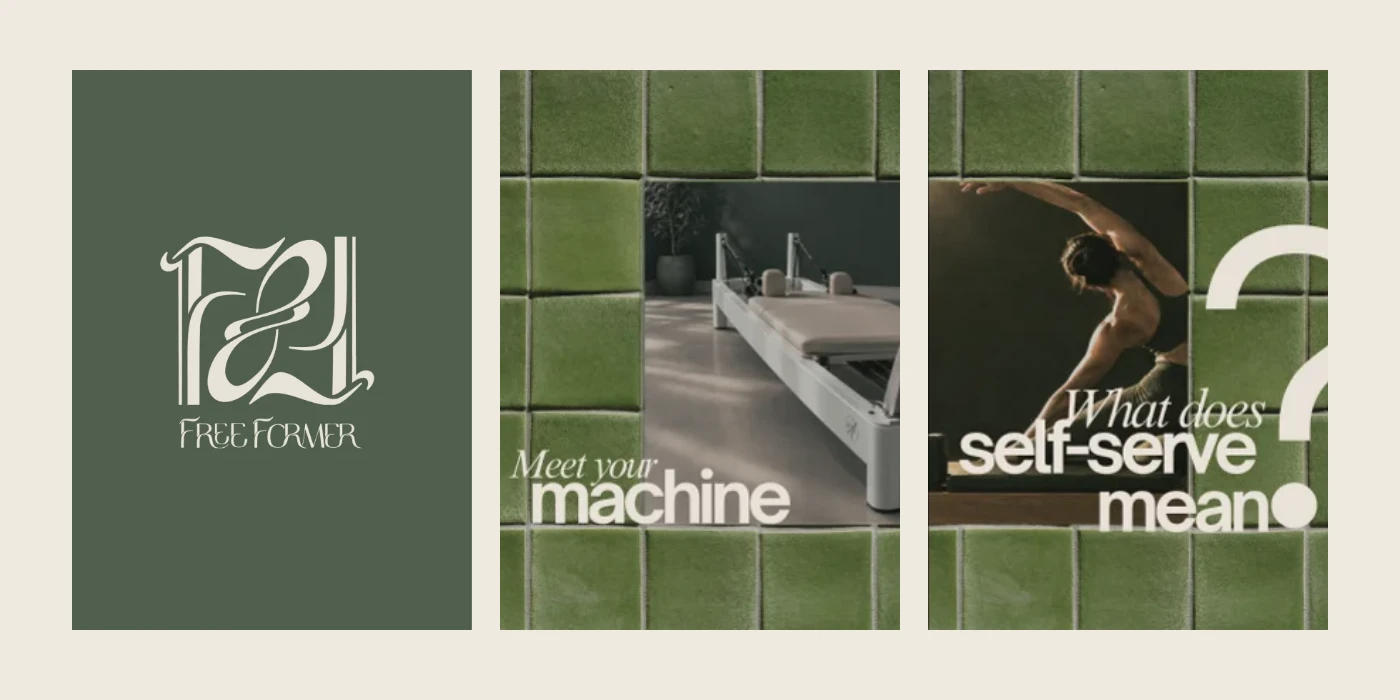
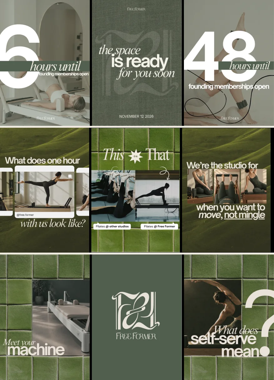
Free Former launch posts scrolling sideways: the permission post, “move, not mingle”, the logo, “the space is ready”, and the voice post.
Overview
Designing a studio for one
Free Former is a reformer Pilates studio on Queen Street West in Toronto with no front desk, no instructor and no class schedule. You book a reformer by the hour, let yourself in and practise alone. The owner needed a brand that could sell an empty room before the room was finished. I led the creative direction and part of the social strategy: research, five directions, the chosen system and the launch posts.
Problem
Every studio nearby sells community. This one sells privacy, and it had no finished space to photograph.
Deliverable
Research boards, five creative directions, a style tile, a design system and component library, a landing page, a brand PDF and launch posts.
Tools & timeline
Figma
2026 · to the November launch
The two voices in type: DM Sans sets the line up, Cormorant Garamond in italic lands it.
Outcome
600+sign-ups before the founding launch
500+Instagram followers before release
3 minfor the founding memberships to sell out
Context
Who it is for
The studio is self-led and unstaffed, so the brand has to do the welcoming a front desk would normally do. It also had to explain a new idea in a few seconds: how does a studio with nobody in it actually work? I wrote for three groups.
People who skip classes
They like reformer Pilates but not the room full of strangers, the mirror or the pace someone else sets.
Regulars with odd hours
Early, late or between meetings. A class timetable never fits.
First-timers who feel watched
Self-led must not feel unsupported. They need to know how it works before they arrive.
Problem
Everyone sells belonging
I reviewed seven studio accounts on four continents. Every one of them sells the same thing: familiar faces, group rituals, a community. That left one corner of the market empty.
01Seven accounts
02Comparison grid
03Table stakes, differentiators, clichés
04Positioning map (what the audit produced)
05Six principles (what the audit produced)
Constraints
The rules that shaped the brand
6principles from the audit; the four that shaped every direction are below
7accounts audited
No room to show
The studio was still being built.
Images use objects, light and crops, never a fake interior.
No faces
Crops at the wrist, ankle, shoulder.
One person alone, or no one.
Quiet, not cold
Warm light and materials.
Restraint in volume and voice.
Self-led, never alone
House rules and booking cues in every format.
A guidance library with its own name.
Landscape
What other studios were doing
Seven accounts, from a members' club in Sharjah to the nearest competitor in Vaughan. I compared what each one sells, its palette, photography, type, signature device, voice and launch offer.
The Core Club
A members' club told in burgundy.
Luces Living
A sanctuary built on light.
KŌR Modern Pilates
The nearest competitor, in Vaughan.
Free Former
The only one selling privacy: the hour is yours, and nobody is watching.
Tradeoffs
Five directions, one studio
Each direction took the same brief, the same palette and the same three captions (launch, founders, booking) and pushed them somewhere different. The owner chose one. Each pair below is a direction we left behind next to the one we kept.
01Warm green over after dark
Left behind · After HoursChosen · Moss and tile
A deep forest green with moss and tile textures and cream type: calm and warm, not nightlife.
Why
After Hours looked like a fashion label at night. It was striking, but its near-black grid hid the product and leaned on photos of a room we could not show yet.
02The practice, not the props
Left behind · House ObjectsChosen · Moss and tile
A body on the reformer, cropped, so people see what they are booking.
Why
Still lifes of keys, socks and cards were charming, but they sold a lifestyle shop.
03One owned colour, not a borrowed metaphor
Left behind · The Light HoursChosen · Moss and tile
One green, owned completely, was the differentiator the audit pointed to.
Why
Light was already another studio's signature, and the greyscale film stills of the fifth direction felt cold.
Brand system
Structure
One idea, four layers
Free Former is the private, self-directed reformer studio on Queen Street West: warm, quiet and entirely yours. Everything else hangs off that line: the mark, the colours, the type, the voice, then the posts.
Scroll through the system. The frame on the left follows along.
Deep#1E201CDarkest framesForest#38443AAnnouncementsMoss#5C6B58Real objects onlyLinen#D0D6CASoft lightGround#EEE9DFPaper and type
Step 1
The mark
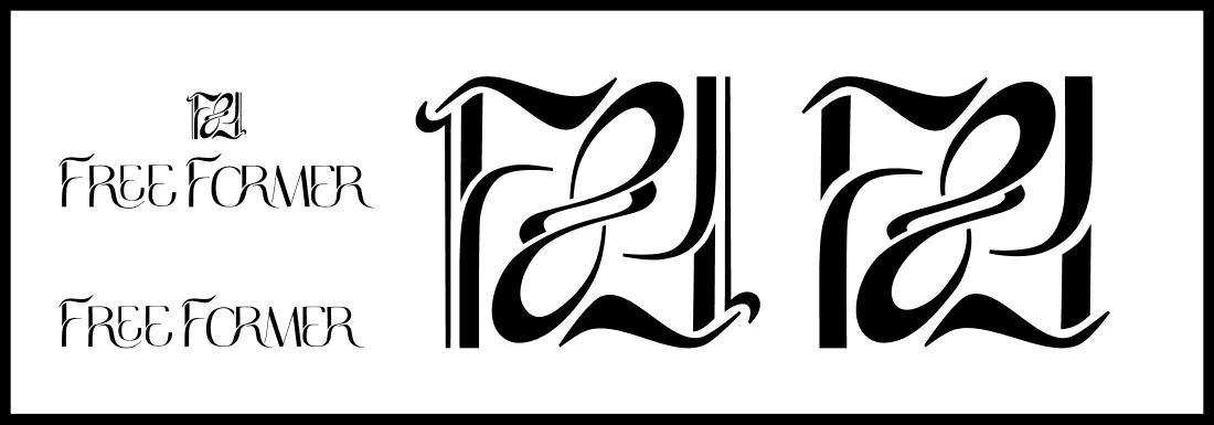
A monogram of two interlocking Fs and a flared wordmark. The monogram is built to sit on things: a key tag, a sock band, a door plaque. Under 48 pixels, use the wordmark or nothing.
Deep#1E201CDarkest framesForest#38443AAnnouncementsMoss#5C6B58Real objects onlyLinen#D0D6CASoft lightGround#EEE9DFPaper and type
Step 2
Five colours, five jobs
Deep for the darkest frames. Forest for walls and announcements. Ground for paper and type. Linen for soft light. Moss only on real objects, like plants. Cream on green is the only text pairing on colour.
Step 3
Two voices in type
DM Sans sets the line up. Cormorant Garamond in italic lands it, on the word that carries the feeling. Same size, same colour.
Step 4
A voice with four rules
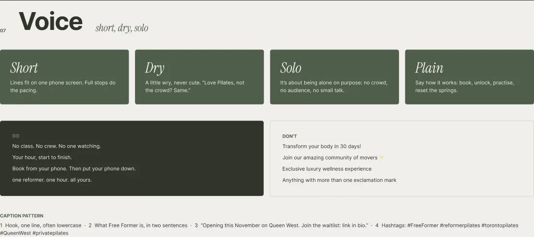
Short, dry, solo, plain. "No class. No crew. No one watching." Never "Transform your body in 30 days!"
Step 5
Templates, not one-offs
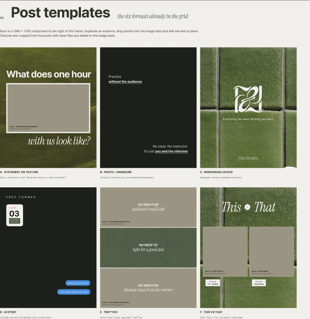
Six post templates the owner can fill in herself: a statement on texture, a photo with an underline, a monogram lockup, a UI story, a triptych and a this-or-that.
Step 6
The launch
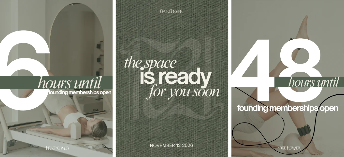
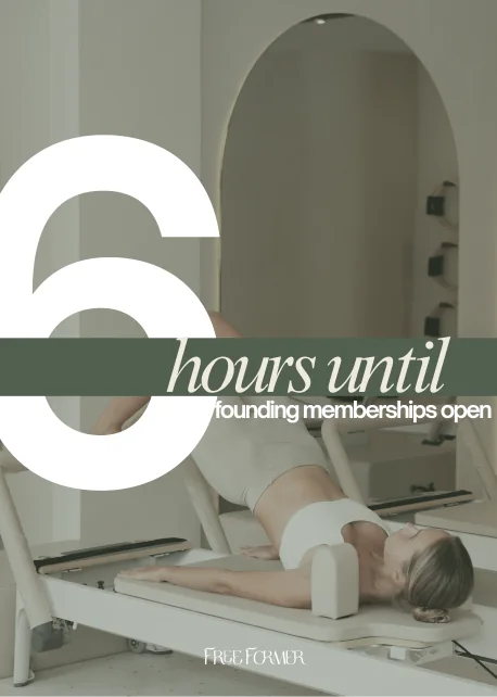
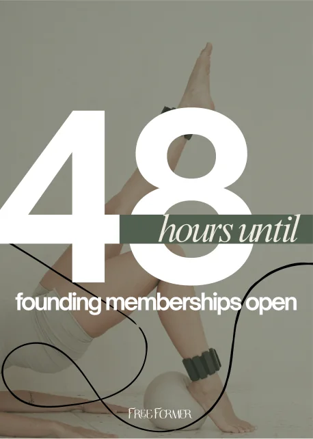
A countdown to the founding drop: 48 hours, 24 hours, 6 hours, then "the space is ready". Each post came with three caption options.
Marketing materials
The launch
Every post, in order
Handoff
What a studio with no staff taught me
Sell what you can show
The room was not built. Rather than fake it with generated interiors, I wrote a rule: objects, light and cropped bodies only.
It kept the brand honest and made the reveal worth waiting for.
A principle settles a debate faster than a moodboard
Six written principles from the audit let the owner compare five very different directions on the same terms.
They also gave us a way to say no later: which principle does this post serve?
Hand over a kit, not a feed
A small studio cannot keep a designer on call. Named colours, text styles and six templates mean the next post can be made without me.
Three caption options per post let the owner pick a voice, and her picks taught me which lines to keep.
For small business owners
What you get from a brand project like this: a one-line position, a logo with rules for where it goes, a palette where every colour has a job, post templates you can fill in yourself, and launch captions written before launch day.